Embodied in every RE/MAX logo and trademark are more than 50 years of brand equity and billions of collective dollars spent on advertising and marketing.
It all started in 1973, when Dave Liniger and Gail Main (who became Gail Liniger) came up with the name RE/MAX from the concept “Real Estate Maximums.” They then created the distinctive red-over-white-over-blue property sign design.
In 1978, as part of a regional promotion, the RE/MAX Hot Air Balloon made its maiden flight at the Albuquerque International Balloon Fiesta. The flight was a resounding success, and the following year, the balloon became the network’s official logo.And just like that, a global brand was born.
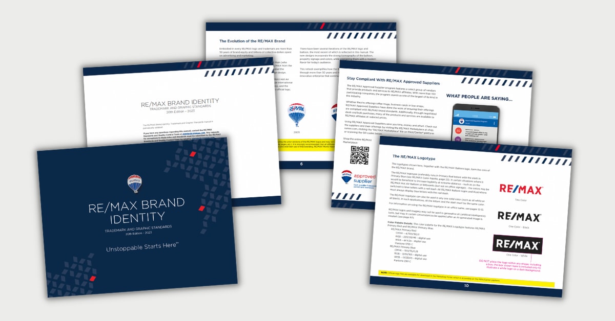
There have been several iterations of the RE/MAX logo and balloon, the most recent of which is reflected in this manual. The new designs incorporate the strong iconography of the balloon, property signage and colors, while energizing them with a modern flavor for today’s audience.
This refresh exemplifies how the RE/MAX brand has evolved through more than 50 years and remains a forward-looking, innovative enterprise that continues to grow and push boundaries.

